Wednesday, 12 January 2011

Environment Reference

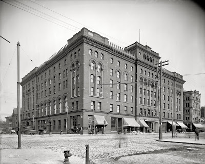
Some time during the Christmas holidays I have been searching for alot of reference for environments. I have found this blog which contained mega high resolution pictures from the 1900's to 1910's. All of those pictures are from America. I have no clue how was it possible to recreate that kind of quality photos from old negatives. Let's have a closer look on some of the hundreds of photos I have saved from that website. One of my main interest is that kind of historicaly based architecture and I have to say that this was an brilliant find. Alot of excellent reference for future environment projects.


Those photos are just crazy ! Early American architecture was amazing. All the adverts on the side of the buildings makes them even more interesting. Funny slogans and adverts with crazy fonts showing of a new anti-cattarah product are just brilliant.


On the streets you can always see a tram with some horses and wagons. Sometimes there will be a car visible. On one of the photos there is even a Grand Express Train which is going through the center of the city using tram tracks which is such an "INCEPTION" scene LoL !


..... oh and here is the early futuristic bullet train prototype :) How amazing is that ?


Also I have acquired alot of photos of people from that age. The fire brigade or newspaper boys which are pretty awesome. All the stuff on that photos like clothing, props, wierd moustaches even the face features makes them perfect reference.


Browsing through the website content and galleries took me couple of hourse couse it has a huge ammount of them. It was defenetively worth the time. Only other way to get that kind of photographs would be propably visiting the history archives. Again I have to say it is a brilliant find. Great job and congratulations to the people from "SHORPY" which are responsible for remastering those historical photos and keeping them alive !

Tuesday, 11 January 2011

FMP Warmup


PROJECT OUTLINE

"Behind the Iron Curtain" is an adventure/action Third person perspective with elements of a Role play game for PC. The whole action of this game takes place in estern europe in the cold war period. The soviet union has forced strickt laws in all of its satelite republics. Comunism and repressions against occupied nations has reached its peak. After Brezhnev's strong politics against the allied countries, Americans and other european countries have reinforced the Iron courtain with a large concrete wall with patrols and armed guards each 100 km going from the north of germany and down to slovenia and cut of any supplies and trade routes.
It is year 1980 riots are emerging all over Poland against the Socialists. Brezhnev have forced repressions against the society and mostly on the working class. Most of the communication with the outside world is down. The soviet propaganda and militia is everywhere keeping the piece and enforcing strickt laws on the nation. Riots are emerging but they are quickly dealt with. Protests from the allied countries are comming in each day.
Action of the game takes place in Poland's port city called Szczecin. It's shipyard was the biggest and most prospering in the estern ourope. It was also the only connector between polish socialistic republik and the rest of the europe. The main charracter has been working there for years untill the soviets closed it down to prevent any contraband or escape. Soviets have remade it to an outpost. Our Hero is on of the oposition/resistance leader which is trying to escape the regime.


AIMS & OBJECTIVES

The main aim of this project is to give a better understanding how a repressed and under a regime country looked alike. Main focus will be on the realistic next gen environments representing the industrial side of the "PRL" Polish socialistic republic in the days of the regime. It will be a bit of a historic spinn off that will represent the whole soviet regime in a cruel and brutal way aswell as presenting the society in a dystopian way.
This will involve alot of archive search in the Institute of the national remembrance. I would also like to refe to the films like "1984", and "The mutant chronicles" - but just the opening 5 min of the film which had good art directory moments ... (the rest of the movie was crap). Simmilar art directory should be applied to this project.
The whole atmosphere in the game would have to convince the player that he is in a militarized and repressed country. I will achieve that by a mix of a special art style and the propaganda sttyle. There will be alot of concepting involved. From Designing outfits of the main character, militia soviet police to environments and stuff like propaganda posters and adverts. I will have to carefully choose my colour palette for the entire project to fit the age period and time it is set in. There will be also alot of prop and vehicle work involved.


AUDIENCE

This game will be directed to the mature audience becouse of its language and brutality. I would like to mainly show here the ruthlessness of the militia. It will definetively have a Pegi 18 stamp.


TECHNOLOGY AND SOFTWARE

This game will be a next gen game. Software that would be needed to create it:
3DS max 2011 - Modelling, UV mapping, texturing, normal map baking, high polygon modeling (Props, weapons and vehicles)
Zbrush 4.0 - Environment and character sculpting for baking down to the low poly
Unreal Development Kit - Environment building, Lightning, setting up the mood of the scenery, special effects, bringing the whole environment to life.
xNormal - normal map baking
Photoshop CS4 - Texture creation and concepting.


TECHNICAL SPECIFICATION:


MAIN ENVIRONMENT

SHIPYARD - 150.000 Tris
this includes a couple of hero assets and props related strongly to the history period and the shipyard itself.
Textures: 2 x 4096x4096 - 1 for the environment (tiling textures) and 1 for the Hero assets which can be devided into 4x2048 or 16x1024. Dependant on the ammount of them.
... that includes Diffuse, Normal, Specular, Emissive (if needed), Displacement maps for environments.


VEHICLES:

Soviet riot APC - BTR-100 - 10.000 Tris Textures 2 x 1024x1024
Junak Motorcycle - 6000 Tris 1 x 1024x1024
... that includes Diffuse, Normal, Specular, Emmisive.


CHARACTERS:

Main Character - 15.000 Tris 2 x 2048x2048
Soviet militia - 10.000 Tris 2 x 2048x2048
Workers/Civilians - 6000 Tris 2x 1024x1024
... that includes Diffuse, Normal, Specular, Emmisive.


REFERENCE:

-I would use the Szczecin's shipyard as a base reference for my environment. It has been closed for 2 years now. It is one of those places back home that reminds strongly about the industrial comunism period. Every item and sign there is filled with that age. Through the years it hasn't been renovated so the state of it in a architectural way stayed the same through years. Only bit that adds to its creepynes are the old rusty ships and leftover equipement that has a strong "pripyat" feeling about it. It is not as abbandoned as that ukrainian city tho.
-"PRL" Archives like chronicles would be highly recomended.


Well this was quite fun writing this. Tho for an FMP project this would be abit too much for 1 person to handle so I would only think about doing the environment from which I would have alot of satisfaction by doing it. A piece of my home city done digitaly, brilliant.
Monday, 10 January 2011

Tripod Concept and Model

This is the concept I have made for the War of the Worlds project. I have aimed for the old sci-fi style and have refered to the original text. I also haven't seen the new movie remake with Tom Cruise which I think was a plus becouse while doing the project I didn't feel like my views or imagination of the tripod was already pointed in some direction. Well here is the concept


Today I went to my dad's work to build up the model of my War of the worlds Concept. After hours of battleing with the weldig torch and finding suitable bits and pieces I have finally finished my steel model. I was hoping I could build a very large (close to human size model) but the ongoing production and the lack of largscale materials prevented me from doing this. That is why I have to work with some bits and pieces I have found from the leftovers of the production. This is what the end product looks like.


Thursday, 6 January 2011

Game Engines

The best part of semester two will be the group project. Not only becouse we will be working as a team on one environment but also it will be a possibility for me to learn UDK. For an environment artist any kind of game engine is a must to learn becouse without it environments or assets created inside 3ds max are just simple models. That is why using an engine pushes environmental work even further.

From what I have researched there are a couple of game engines used in the industry at the moment but only some of them are released to public usage. Engines like Cryengine developed by Crytek which had its release with the game called Crysis. At the moment it is one of the best looking engine on the market. I Think it's current version is CryEngine3. This one is very hard to get becouse Crytek hasn't released it for public usage. Here is a short demo of what it can do.


Next engine I would like to mention is Source produced by beloved Valve :) This engine has been used in Team Fortress 2, Portal, Half Life 2 series and many other valve games and mods. To be honest this is I think the second popular engine that is out becouse of the huge modding community serounding Valve. I think that at some point during summer holidays I should join up a modding community and see how it works out just for the expirience and learning new stuff.


There are also engines like Aureora, Havok, Infinity, Unity and a new engine that is developed by CD Project red which is called RED engine. This one has been made particulary for The Witcher 2. The first part of this game used a modified Aurora engine but becouse they wanted to set the bar alot higher in their second game they have hired alot of coders and have written their own engine so they could do whatever they need to satisfy their needs.

One perticular engine I would like to mention is Unreal. Used throughout all the EPIC GAMES products like Gears of War series, Unreal Tournament. It so popular that different developers buy a licence to use it becouse It is very good and easy to operate if you get the basics down. The biggest advantage for this engine is that it has been released to public use and has a large community site with all the tutorials and information you need to start working with it. It can be used to create environments, present models but also to create whole games thanks to its capabilities. The Ball is the name of a game that has been recently released. The game started as a mod created by couple of artists and now it is available for puchase. This is just an example what people can do with it.

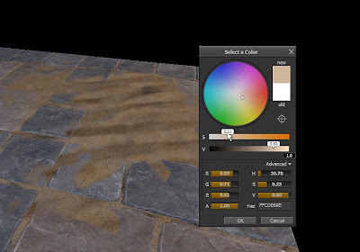
UDK is so big and has so much features that learning all of them, by all of them I mean Coding, Kismet, VFX would take very very long. As I have mentioned erlier this engine can bring a whole environment into life thanks to the possibilities it offers to the user. There are few techniques I have discovered while researching and studying what unreal editor is capable of. First of all I would like to mention the posibilities of the material editor. With it an artist can do loads of variations and improvements to his textures. Adding different links and passses, changing hues, overlapping textures, adjusting them etc etc. Those are just the basics but there are alot more to discover and get into. Also one of many features is Mesh painting. By having different set of textures for example a tiling floor and a texture with a tiling sand the user can paint the sand on to the floor by vertex blending mode. It saves alot of time and texture space. Those are pretty much new stuff to me but by the sound of it it is very very usefull and worth getting into it more. Whole UDK offers a wide range of effects and solutions. Before I started exploring it I had the idea that everything within an environment has to be done before in 3Ds max. Lightning, composing materials, creating terrain etc etc. Knowing all of the possibilities now I can clearly see a proper line of work. For example max can be used only to create "Modular" bits and pieces, single objects that can be repeated and thats it. After that is done everything can be imported inside UDK and by creating a simple BSP terrain we can add our meshes to the scene. Using the grid position them correctly, add a skydome, build lightning, add some particle effect (previously learned how to do that ofcourse) and our environment is pretty much ready. Now it is time for tweaks and polish. Well I have skipped the whole concepting and art side of this becouse I was assuming it was done beore starting modeling in max.


One thing is for sure. UDK does magic. It is a very powerfull tool as any other engine. I think that learning it and seeing all the work that I have produced inside 3Ds max inported into UDK and working as a playable area would be very satisfying. There is nothing much more rewarding then seeing your creation brought into life so that you and your friends could enjoy playing and testing it.

Links & Reference:

http://source.valvesoftware.com/
http://mycryengine.com/
http://www.udk.com/

Wednesday, 5 January 2011

Level Design

In the future I would like to work as an environment artist in one of the AAA title shipping studios. Learning all the required art and technical skiils is a must to achieve it. Although art comes before technical skills. Level design is a very important part in being an environment artist. To create believeable, playable and interactive designs one must master all possible knowledge starting from architecture principles , traditional art skills and ending up on the technical side which is knowing the tools that can help you achieve the goal. Those tools are mainly game engines like Unreal Development Kit but before even starting using it we must know the rules and principles of level design.

First of all an artist or a level designer must know his industry. What people need and what players expect from the next new AAA title. Believability and attention of the player is very important. The level has to convince the player that he is inside a different world, different to his or hers reality. Once this is acomplished and you have the full attention of the audience the game or lavel was designed for then an artist can move to the other aspects of level design. Interactivity and entertainment. There is nothing much more boreing in a game than a static and dull environment. Most of the modern day next gen titles involve alot of work in the level design's visual and interactive apperal. Although some things have to be secreficed for that. Developers have to limit themselves with the budged and time that they have. There hasn't been a perfect product yet on the market that haven't secreficed something in order to achieve another aspect. For exampe the scale of an environment has to be secrediced for the graphic's and vice versa. That kind of "perfect" title is imposiible to make becouse either it would took a lifetime to create, through wich the game industry standards could change or it would colst horrendous ammounts of money. Good example here would be Duke Nukem Forever. How long has it been 12 years ? or more ... and finnally gearbox took the game over from 3D realms. Tho I still don't think of it as a perfect game but wanted to give an exaple of a game that is taking forever to create becouse of the studio which wanted to create an "epic" game without sacreficing anything. I sitll remember a trailer from the year 2001 with the first sneak peak preview of the game and the release date 2002 !
There has been plenty of jokes around that topic. Things that took less time during Duke Nukem Forever's development or things like "It took less time for the Beatles to form, release all of their albums, tour the world several times, and finally break up" or "Stephen King has written 16 novels" etc etc. There is a huge list on that ! But let's get back to the actual topic.


Level design has changed and will be changing with each year and more demanding customers. But how to be a good level designer ? Another key feature is "Uniqeness". There is alot of repetition in some game titles that players are already bored of. How many Modern Warfares we have already seen ? How many same racing games, strategy games or sport games? The industry keeps producing them continuesly each year and people buy it. Same games each year. Average console player either plays Fifa or Call of Duty .... why ? I think I don't want to hear the answer to this one. I still want to think that this community has some understanding of good games but the facts are opposite.

All game levels are done in pretty much the same ways these days. Apart from new graphics and amazing art side of them there isn't anything new in them. For some time now I've been playing games not mainly for the gameplay in most cases but selecting interesting titles to see the art side of the game. Well to sum it up about the level design here is a picture how the FPS level design worked in the past and how it is now ;)


References:

Gamasutra Level Design

Tuesday, 4 January 2011

Research and thoughts on Visual Compositon

Visual composition is a term that refers to an overall structure, placement or arrangement of visual elements in art. It is a key skill for an artist. Knowing it and using it are two different things. People may have a basic understanding of it but if they don't apply it to their work it can bring the whole art piece down. As for myself I have an basic understanding of it but sometimes when I get sunk into a painting or a 3d scene I forget about it and it is visible for a person that has a wider understanding of those principles. It is a habbit I am not particularly proud of but for sure it is a thing that I could work on improving. In this blog I will write about my rescent research about Visual composition and share some thoughts about the difference between 2D and 3D.

Within visual composition there are a couple of basic rules to remember when doing art. Here I would like to pinpoint some of them:

LINE and LAYOUT
It is the path that our eyes will follow when looking at an image. Those lines can be curved, straight, vertical, horizontal and any other shape tha will be pretty much easy to follow with an eye. Those line don't have to be very visible but can be sugested by different key points on the picture and the human mind will automaticly connect all the points and follow the path. I think that this key feature is one of the hardest to master in a painting. It requires alot of planning and scene composing . The simplest example of it would be the Fibonacci spiral that is the most common.
Objects have to be placed in a specific order. A common mistake by art students is that they put stuff in a chaotical order on their image. It is always better that those objects form a simple geometric figure.
CONTRAST
It is the most important to attract the viewer to the picture. Putting light objects on dark background and vice versa can really push and attract the eye in certain places of an image.


THE GOLDEN RATIO AND RULE OF THIRDS
Some people call it also the golden mean. It was known already in ancient Egypt. The simple explanation of it would be that the best poibnt to place an object is one third form the horizontal or vertical border of the frame. Why ? All these points seem natural and can attract the eye much more.
FRAME FORMAT
It is a very simple rule. If the scene has a lot of vertical objects it is the best to use a vertical format of the frame. The same rule applies for horizontal objects and frames.


COLOUR
Proper use of colour could be winner in your picture. They key to it is to use coulours either that corespond near each other in the coulour wheel or complementary colours which are opposite to each other on the color wheel. There are also features like hue, saturation (intensity) and other very important stuff to remember when picking the pallete.
One very important rule that I found out through my research is the Colour spot. If we have a color spot in one part of the frame then we need to have something which will attract the viewer’s attention on the other side too. There is way much to write and understand about colour that could be written here. I think I might evaluate that in a later blog post a bit further since colour study and understanding it Is one of my this year's goal


I could write here alot more about those principles but lets get back on track. So how it is applied in 2D then? Well it's very simple. I could refer to one of my previous blogs about planning and concepting becouse at the end it all comes down to it. Alot of preliminary composition sketches, working out different layouts and compositions is the key. I know now that I need to push that more further.

How deos visual composition transfer to 3D then ? What about the 4th dimention, those interactive and dynamic elements inside an environment? My latest researched has shown that bringing environments to life with proper lightning setup, use of colour and adding those little effects that could be done with UDK could bring an environment into a next level. Recently I have been watching and reading alot about environments. One artist and his whole development of his FMP project focused my attention. Jason Lavoie's Demon throne. He has created an outstanding but relatively small environment and brought it to life using simple composition rules. On his channel on Vimeo we can see the whole proces behind it with his thoughts and comments on it. Some of the environments I have seen on pictures or demo reels feel a little bit empty and deserted and transfering those 2D art principles into 3D helps them stand out.

1. De-Constructing "DemonThrone" - Introduction from Jason Lavoie on Vimeo.


To sum it up I think the statement that developers are looking for artists not technicians is very much true. As Jolyon said "We can teach someone to use Zbrush in a week or two but we can't teach him how to be an artist...". I think that my time for learning how to model eficiently and good is over now. Now is the time when the Art side should kick in and I will definetively spend more on drawing, painting and texturing couse those are the key skills I still need to properly devolop so they won't bring my work down in the future.

References:

COMPOSITION & the ELEMENTS of VISUAL DESIGN

De-Constructing "DemonThrone"

Composition and Design

Train Station painting


After quite a long time spending on this piece I have finally finished it. I am quite happy with the outcome.

Saturday, 1 January 2011

New Year's Resolutions


So its 2011 now and it is a time for writing down some new year's resolutions.
I hope that this year will be totally different then the last one. I am already starting to feel this abit becouse over the last couple of months my approach to self improvement has changed alot. I still have that feeling that I don't know as much as I should be knowing at the moment but when I look back at myself I come to think that it has only been a year and a half when I have started this course. Propably I expect too much of myself but in a way it is a good thing becouse it keeps me pushing towards self development. There is still alot to learn and I know that. Sometimes it can be very very overwhelming. I think that with taking small steps at a time I will get where I want to be.

Well anyway here are some of my new year's resolutions:

- Do more work , Do more work and again Do more work
- Draw and paint more
- Learn art fundamentals again
- Learn UDK and start developing myself as an Environment Artist
- Improve my artistic judgement.
- Stick more to the briefs.
- Devide the time evenly between 3D art and 2D art ( I honestly sucked at this last semester )
- Finish my personal work so I can apply for an Internship over the summer vacation.

Well I will do my best to fulfill and keep working on all of them :)

Planning and Concepting

Through the christmas holidays I have spend alot of time reading articles and blogs of proffesional artist. I have also watched alot of videos and talked to some people like Kevin Johnestone, which did some awesome environment stuff for Unreal and Gears of War 2 and some other graduated and proffesional artists. Some time ago I have also contacted Daarken and asked him some questions about the importance of painting and drawing. Anyway my point is that becouse of this kind of activity I have widen my range and understanding on how things work in the art world. I have been given some very usefull advices from those people. Becouse of this now I know how important planning and concepting is when it comes to creating art. As they said to me "Pen and paper ... it is the most powerfull tool".


This year I know that rushing into projects without proper planning is bad becouse I might get stuck at some point and waste time. Not only that but planning beforehand gives me better solutions and artistic judgement. My latest research I did on environment art thanks to the polycount wiki proved to me how very important it is when it comes to environments. There is so much things to worry about when creating an environment that I haven't known about before. Those are mainly small details and rules that apply both into 3D and 2D work that make an environment perfect. That is why planning them before hand and having a checklist on what to do and what to plan helps alot. I am gonna sound like captain obvious here but planing brings only pluses. Instead of pointing all the advantages of it I will talk a littlebit about the disadvantages. First of all as I mentioned before it can lead to wasteing time. Without knowing what to do exactly people get stuck at some point. For example they reach a point where they have to go back to research and they add theirself some additional work time which may be needed at the finishing stage. Next one is poor judgement. Without proper research of the subject people don't see the possible ways they can lead their project into something unusual and extrodinary. I think that books and libraries are the best sourse of unique informations that people won't be able to find on the internet. Nowdays people too much rely on the web. Google images and wikipedia or simmilar websites to this. Its all available to the public so anyone can access it. I don't say that internet is a bad way to find stuff but If you want very unique stuff go to the library.


So how would a perfect planning look ? I will list some things here on what I would do for a project for at least a week before I start modeling.
- Research the subject, gather and brainstorm alot of ideas and keywords to research further.
- Visit the library, get some books and photoalbums on the subject.
- Get a pen and paper. Brainstorm and draw a possible scenery. Do some thumbnails and doodles. Basicly spend some times concepting and brainstorming the possible solutions carefully judgeing what will fit in and what not. It is always worth spending more time then expexted on this stage becouse this is where your idea pops out. Usually people spend too little time and they go with the initial idea which is bad.
- After doodling there is the stage of proper concepting when you put all your stuff into nice polished concept.

Well this is ofcourse a rough describtion of how planning and concepting should look like. At the end of this blog entry I would like to sum it up that the rule of 5p's is the best way to describe how important planning and concepting is important becouse Proper Preperation Prevents Poor Performance !

Links and References :

Polycount wiki : Environment Concepting

Polycount wiki : Environment Modularity

Vehicle Design PALADIN APC


Here is a concept of a military APC vehicle. A bit futuristic armed & armoured person carrier design for the United Nations. I still wanted to keep the feeling that military vehicles desigs stayed pretty much simmilar to nowdays. Didnt want to add very bendy shapes becouse it would loose its believability as a military equipement.